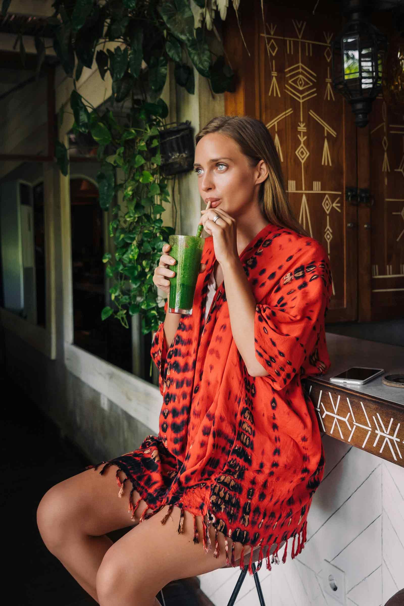
The Smooth Spot is a juice and smoothie bar that offers a wellness-focused menu of organic, cold-pressed juices, smoothies, and plant-based snacks.
The brand combines a commitment to health with a playful, nostalgic charm inspired by retro aesthetics.
The business appeals to customers who value both wellness, organic feel and timeless style.
The Smooth Spot
BRAND OVERVIEW
SERVICES RENDERED
Basic Brand Identity Design BRAND IDENTITY DESIGN PACKAGE
This package provides the essentials to create a clear and noticeable brand by emphasizing key branding materials.BRAND TONE
Playful, Welcoming, Nostalgic, Health-Centric
Branding Key Deliverables
Custom Primary logo and additional sub-mark logo
Custom illustrations reflecting brand aesthetic
3 bonus launch graphics for Instagram
OBJECTIVES
Brand Identity: Create a cohesive and nostalgic retro-inspired identity that reflects the quality and wellness focus of the brand.
Customer Loyalty: Encourage repeat visits and engagement through thoughtfully designed loyalty cards and consistent social media branding.
Social Media Presence: Establish a visually engaging online presence with 3 launch graphics to promote the brands products and services.

BRANDING DELIVERABLES
Custom Logo Design, Color Palette, Typography, Custom Illustrations, Brand Style Guide
MARKETING DELIVERABLES
3 Bonus Social Media Launch Graphics

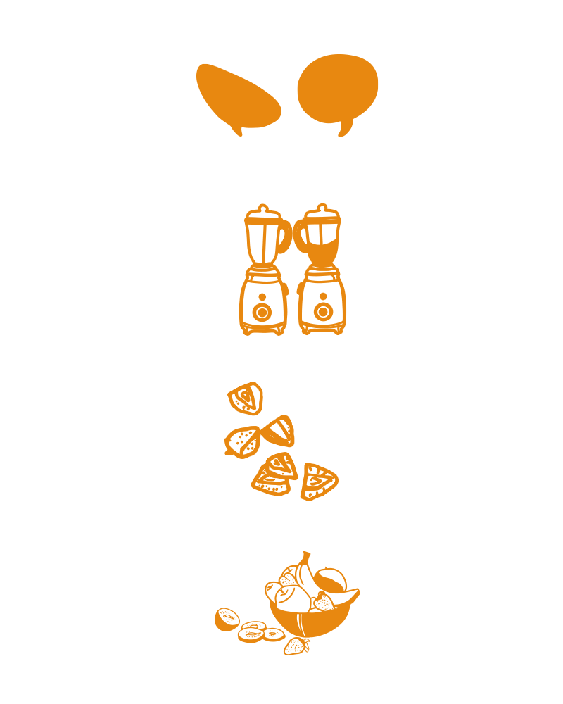
Fruit Illustrations: These illustrations of cut strawberries, bananas, and a fruit bowl evoke the bright colors of the brand in a simple way.
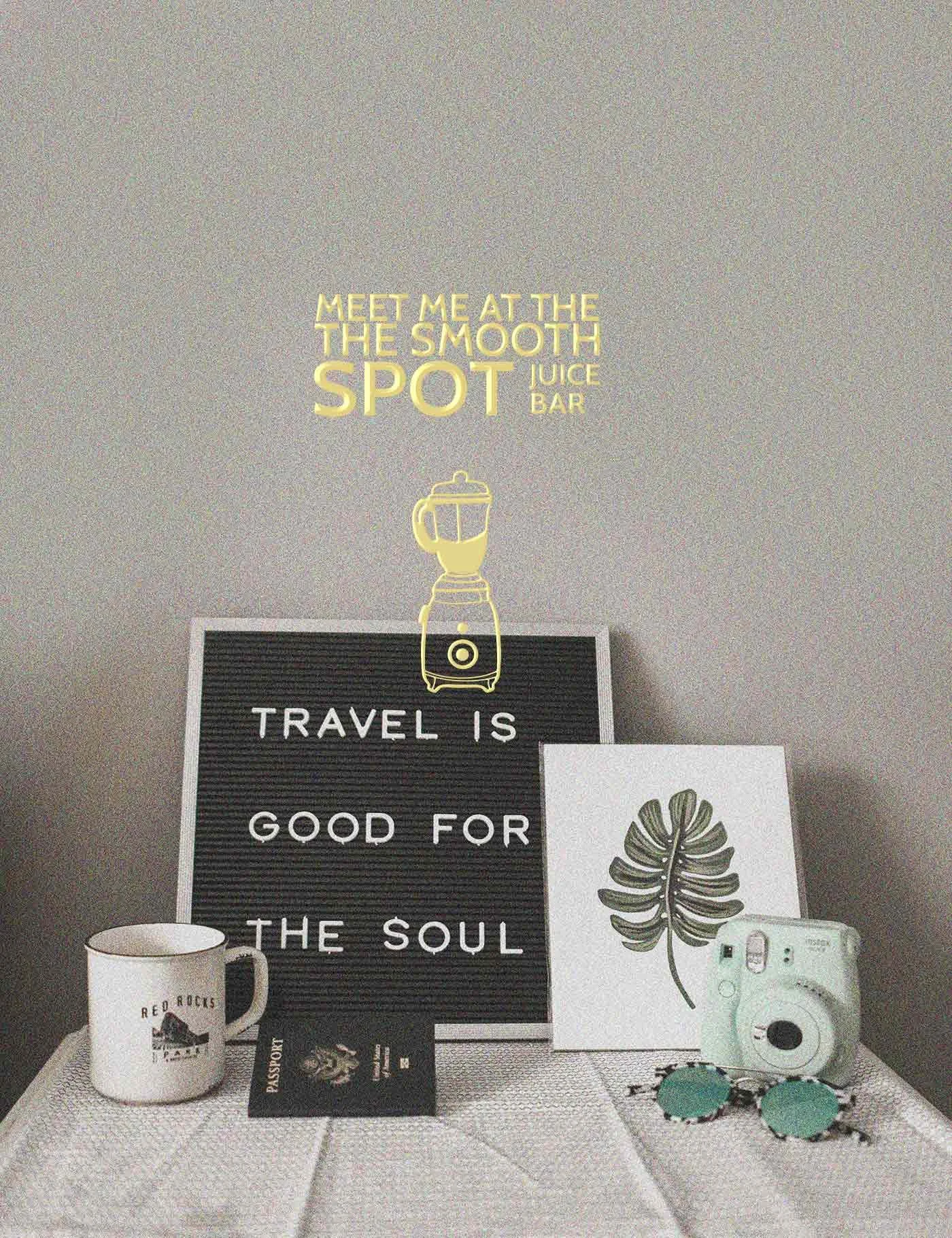
Retro Blender Icon: A vintage blender illustration expresses the brand's nostalgia.
Comic Bubble Effect: Bold speech, retro-style bubbles were created for marketing materials to attract attention and enhance the brand's playful tone.
CUSTOM ILLUSTRATIONS AND VISUAL AESTHETIC
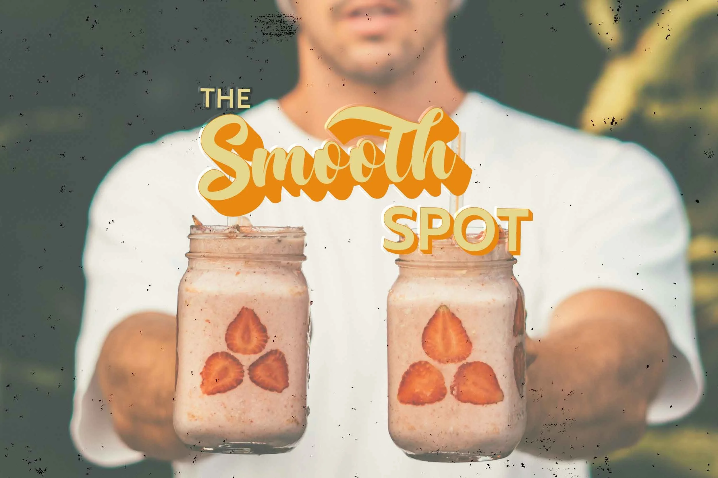
The font chosen for the brand's title, “Smooth Spot,” was customized to evoke a sense of nostalgia and reflect the retro message that the brand aims to convey.
The Submark logo has two parts: the swirl represents the whirlpool effect in the blender, which moves solids down to make sure they mix evenly with the blade, resulting in a smooth mixture. The second is the double letter "S" in the motion, which stands for the brand "Smooth Spot."
Brand Design Direction
We decided to go with a checker pattern to effectively repeat the retro style and overall vibe of the brand, while utilizing the playful color palette featuring bright orange hues to effectively convey the lively and cheerful nature of the brand.
This distinctive pattern was thoughtfully created to be used throughout various marketing materials, as well as be prominently featured in the brand's Instagram grid.
The checker pattern not only adds visual interest but also evokes a sense of nostalgia, reminiscent of the charming aesthetics often found in quaint old-time cafes.

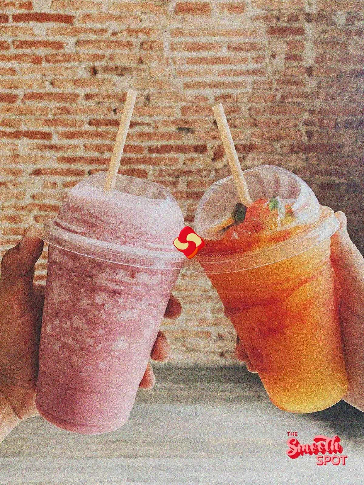
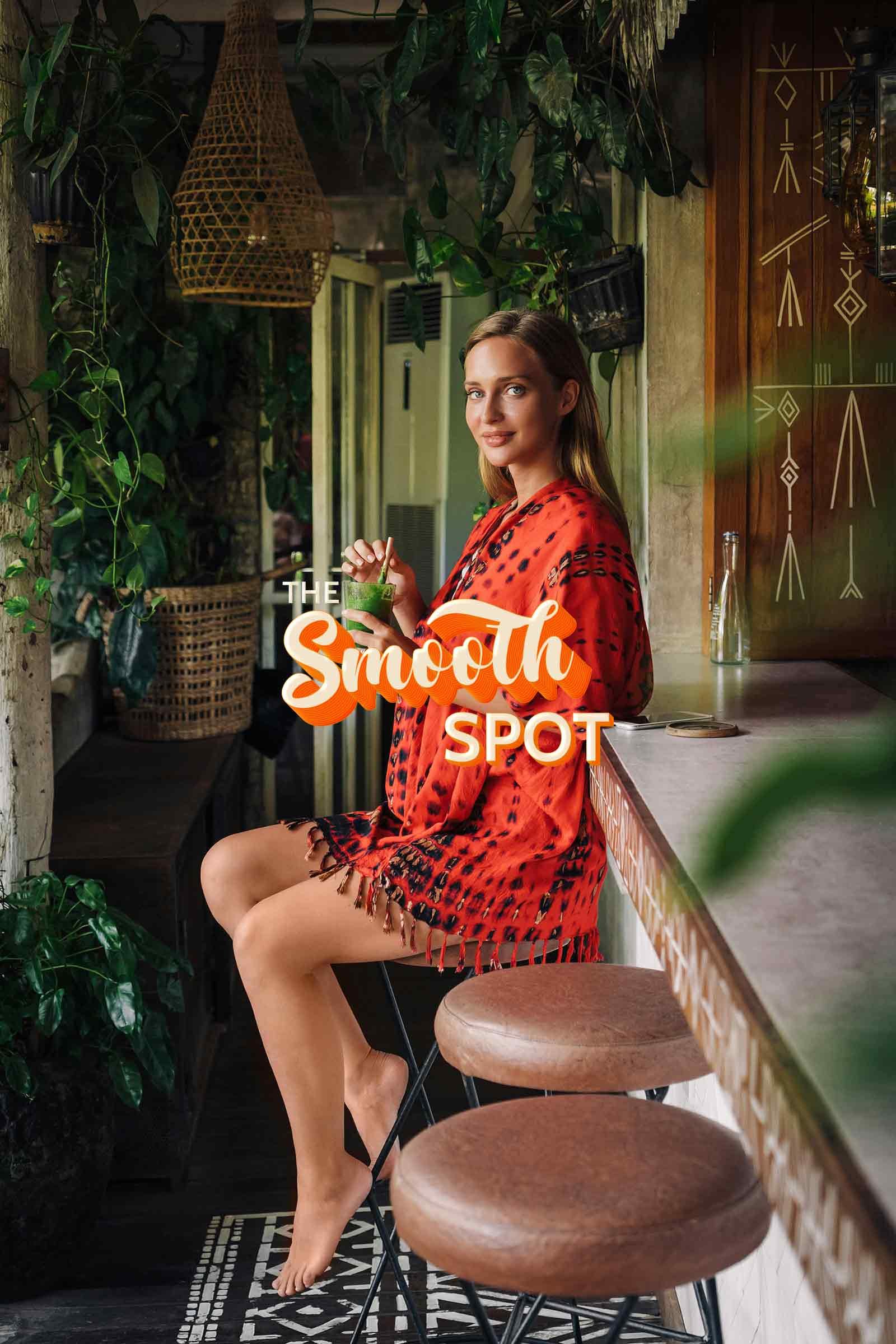
Brand Photography Direction




Inspired by this project?
Let’s create a brand identity and marketing that captivates your audience and drives success.


